Our Brand
Brand identity guidelines and principles

Introduction
This brand guideline will us ensure that ALTRES brand stays true and consistent to itself. If there are any questions pertaining to this guide, please contact someone from business development to assist.
Our Logo
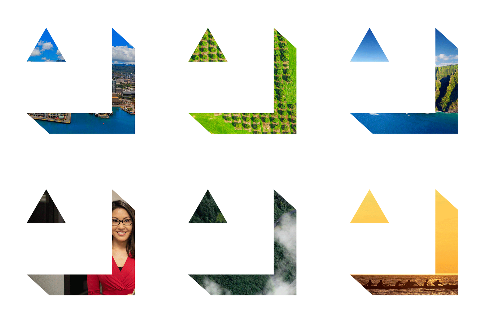
Our logo represents our future aspirations and acknowledges the value of our past. Our logo is strong and dynamic. Its shape forms the basis of much of our identity.
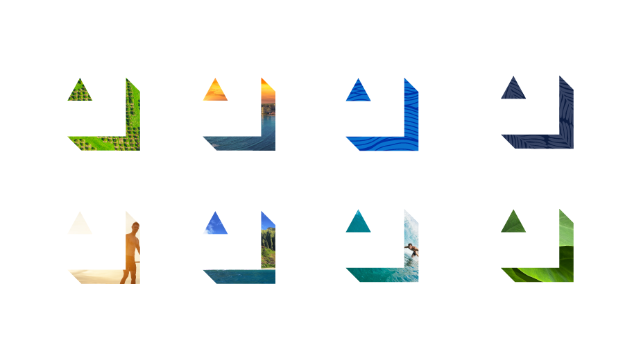
Our logo represents our future aspirations and acknowledges the value of our past. Our logo is strong and dynamic. Its shape forms the basis of much of our identity.

Elements
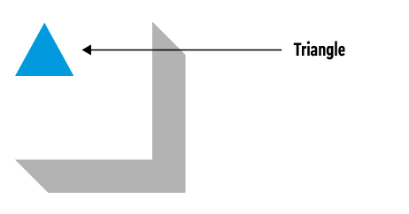
The Triangle is a representation of our values of Always Reaching Higher.
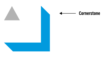
The Cornerstone is a connection to our heritage and a marker (foundation) for the future.
The logo
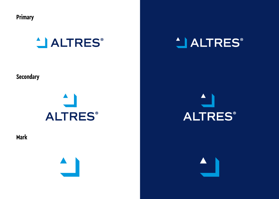
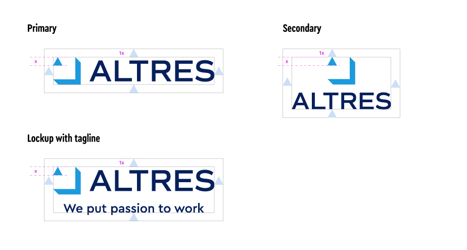
There are three versions of the ALTRES logo: primary, secondary, & the Cornerstone.
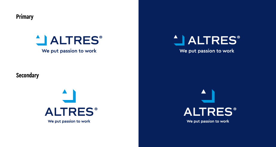
Logo with tagline
Where space allows & messaging is limited, the logo with tagline may be used, however, its usage is on a case-by-case basis.
Logo measurements
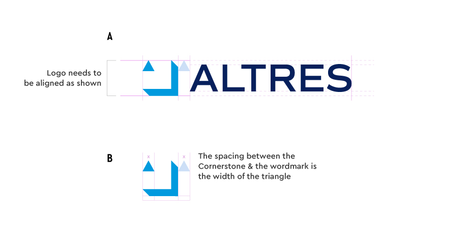
Our logo measurements demonstrate the craftsmanship & precision that make up the ALTRES logo. When applying the logo, please be mindful of the following:
A: The spacing between the wordmark & the Cornerstone cannot be altered or adjusted in any way.
B: The Cornerstone needs to be aligned with the wordmark in both horizontal & vertical instances. The spacing in the vertical example is measured by the 2/3 of the Cornerstone width from the wordmark.
Please use the provided assets & be mindful of medium. A four-color (CMYK) print & three-color (RGB) digital versions are available.
Note: for special occasions that require a change to the logo color, please seek approval from Business Development.
Logo clear space
The Triangle defines the specific amount of space that a logo must have on all sides, no matter where it is used. The reason for clear space is to ensure that a logo maximizes visibility & impact.
Logo best practices
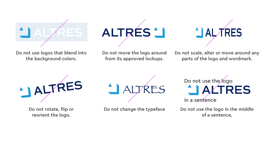
When using the ALTRES logos, use the logos as they are. Do not attempt to recreate or move logo elements.
Brand Architecture
Naming Strategy
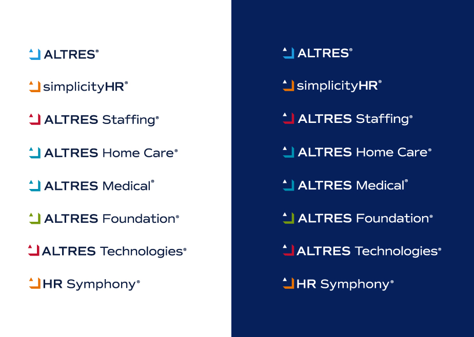
To create sub-brand logos, we use the ALTRES logo & our Commuter Sans font.
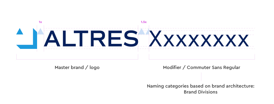
Brand architecture system
The ALTRES logo is the brand unifier for all of the sub-brands. It should always anchor any brand or product.
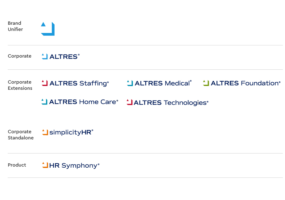
ALTRES BRAND LOGOS
These are all of our sub-brand logos.


Colors
An Island of Colors
Ocean Blue is a key signifier for the brand. It unifies all the colors and should be be consistently used with all of the our brands. When the mark is used on Ocean Blue (or dark color), the triangle should always be white.
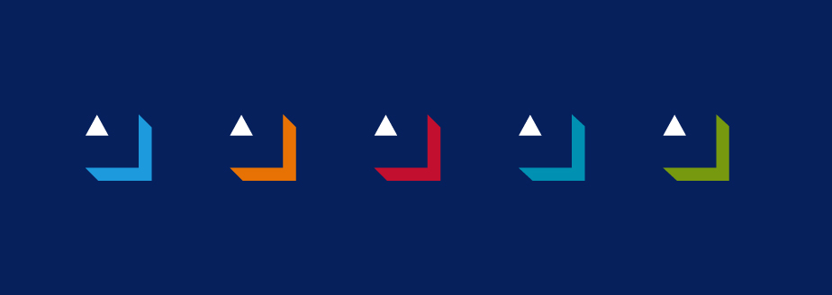
Primary Color Palette
ALTRES Ocean Blue and Sky Blue are our primary colors for the ALTRES brand. When associated directly to the ALTRES parent company, these colors should always be used.
Ocean Blue

PMS: 281C
CMYK: 100, 90, 31, 35
RGB: 0, 32, 92
HEX: 00205c
Sky Blue

PMS: 2925C
CMYK: 77, 25, 0, 0
RGB: 0, 154, 222
HEX: 009ade
Primary Brand Color Palettes
ALTRES Ocean Blue ties all of our brands and logos together. It is used for the wordmark and key elements for all of our brands. Each brand also has its own primary color and signifier.
Sunset Orange

simplicityHR
PMS: 152C
CMYK: 6, 66, 100, 0
RGB: 232, 114, 0
HEX: e87200
Hibiscus Red

Staffing + Technologies
PMS: 200C
CMYK: 16, 100, 87, 7
RGB: 193, 2, 48
HEX: c10230
Coral Reef Blue

Medical + Home Care
PMS: 632C
CMYK: 92, 24, 23, 0
RGB: 0, 145, 179
HEX: 0091b3
Jungle Green

Foundation / Community
PMS: 377C
CMYK: 58, 22, 100, 4
RGB: 120, 153, 4
HEX: 789904
North Shore Blue

PMS: 285C
CMYK: 91, 53, 0, 0
RGB: 0, 113, 206
HEX: 0071ce
Midday Sun

PMS: 123C
CMYK: 0, 23, 91, 0
RGB: 255, 198, 41
HEX: ffc629
Shoreline Gray

PMS: Cool Gray 1C
CMYK: 15, 14, 17, 0
RGB: 214, 209, 202
HEX: d6d1ca
Brand Color System
Each brand has its own primary color. These colors need to be used at all times as specified.
Typography
Our Font
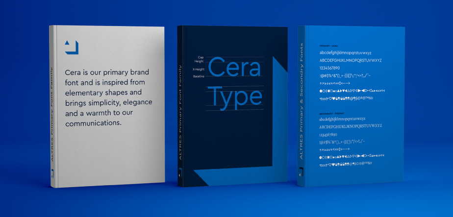
Cera is our primary font and should be used for all advertising and brand applications. As shown below there are situations where our secondary font, Freight, can be applied.
Primary Font
Cera Pro is our primary font. Our brand communications use three main weights: regular, medium and bold,

Secondary Font
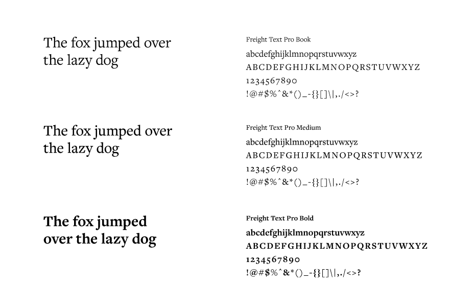
Freight Text Pro is our secondary font. These three weights are the main ones to use: book, medium and bold. Typically Freight Text Pro is used for body copy applications, but there are exceptions when it can be used as a headline.
Typography Applications
Cera is our brand font. Bold or regular weights are preferred to create consistency in communications and should be left aligned where possible. Headlines and supers my centered over live action. Bold can be used for more emphasis and is primarily used launch communications.
Editorial quick guide:
- Headlines need to be in sentence case and do (or do not use punctuation?). Possible exceptions: Two short sentences in one headline. “Work Smart. Work Simple.” Or “Need payroll? We can help.”
- Subheads need to be in sentence case and use end punctuation.
- CTAs (buttons, etc.) need to be in sentence case and do not use punctuation.
- Avoid widows and orphans if possible.

Web Typography
Montserrat is used for headlines and Open Sans is for body copy. All headlines should use color: #00205c.
Montserrat – Headlines
1 2 3 4 5 6 7 8 9 0 A B C D E F G H I J K L M N O P Q R S T U V W X Y Z a b c d e f g h i j k l m n o p q r s t u v w x y z
All headlines should use color: #00205c
Open Sans – Body Copy
1 2 3 4 5 6 7 8 9 0 A B C D E F G H I J K L M N O P Q R S T U V W X Y Z a b c d e f g h i j k l m n o p q r s t u v w x y z
Size: 18px + Line Height 1.8em
Body copy color is #1d242d
H1 Headline
Size: 50px + Line Height 1.2em
H2 Headline
Size: 33px + Line Height 1.2em
H3 Headline
Size: 28px + Line Height 1.2em
H4 Headline
Size: 20px + Line Height 1.2em
H5 Headline
Size: 18px + Line Height 1.5em
Body copy
Body copy is 18px with a line height of 1.8 em. This is a paragraph of one to two sentences. Open Sans should be used when ever possible, otherwise a default Arial, Helvetica, etc. can be used in its place.
Links
URL link colors are #0071ce.
Buttons
Buttons also use #0071ce.
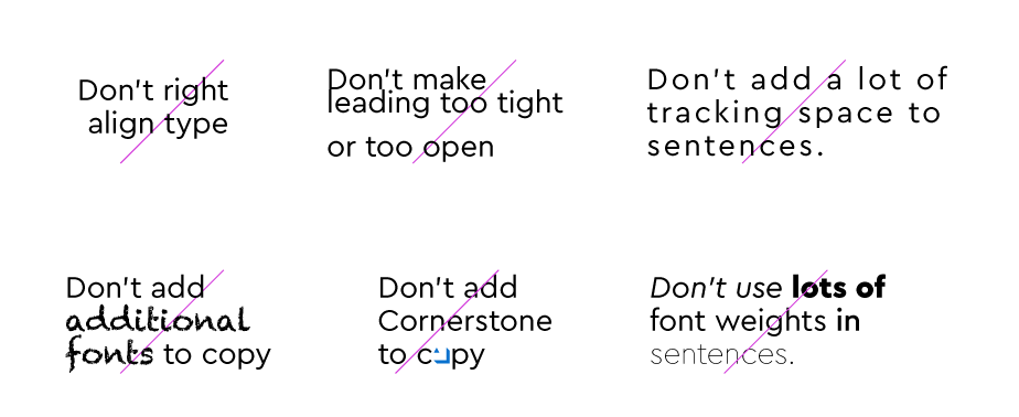
Typography Best Practices
The following best practices apply for all ALTRES communications (video, print, digital, & social).
Photography
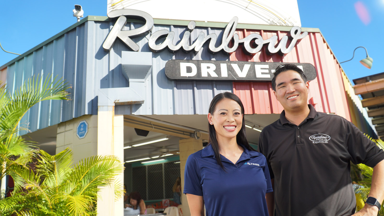
ALTRES photos capture the character of their subjects in authentic ways. Through photography, we add context and depth to our messages.

People
Shots with people should capture life as it exists for our employees and clients. They should always be in a setting that is authentic to the story and subject of the image.
Employee Headshots
Employee headshots are taken in a studio with a solid background. The lighting should emphasize the subject and not the environment.




Customer Photography
Photos of our clients should be shot in their environment and highlight the personality of the their business and what they do.
Photography Guidelines
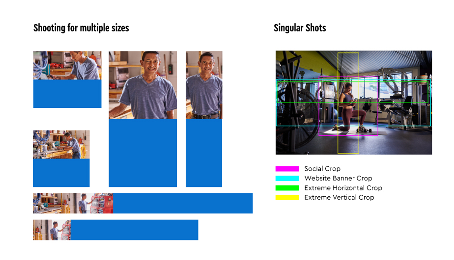
With the need for various media sizes, photographers should shoot multiple croppings of the same content. This will provide flexibility when placing it into layouts, but it will also help tell a bigger story. When singular shots need to be captured, photographers should avoid cropping in camera and stay mindful of the safe zones for horizontal and vertical crops.
Illustrations
Illustration Style
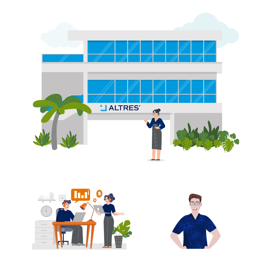
Our illustrations are free flowing and use our color palette. When illustrating ALTRES “Employees” they should always be wearing a Ocean Blue top. The top can use a Hawaiian motif or pattern to give it a unique look. The clothing bottom should always be in a darker gray and kept simple.
Iconography
Icon Examples
Our icons are used across all of our communications. Only approved icons should be used. Our icons use a 2:1 stroke ration. They can be displayed with one color black or black with the Sky Blue fill.
Black Stroke
Black Stroke with Sky Blue
Stationery
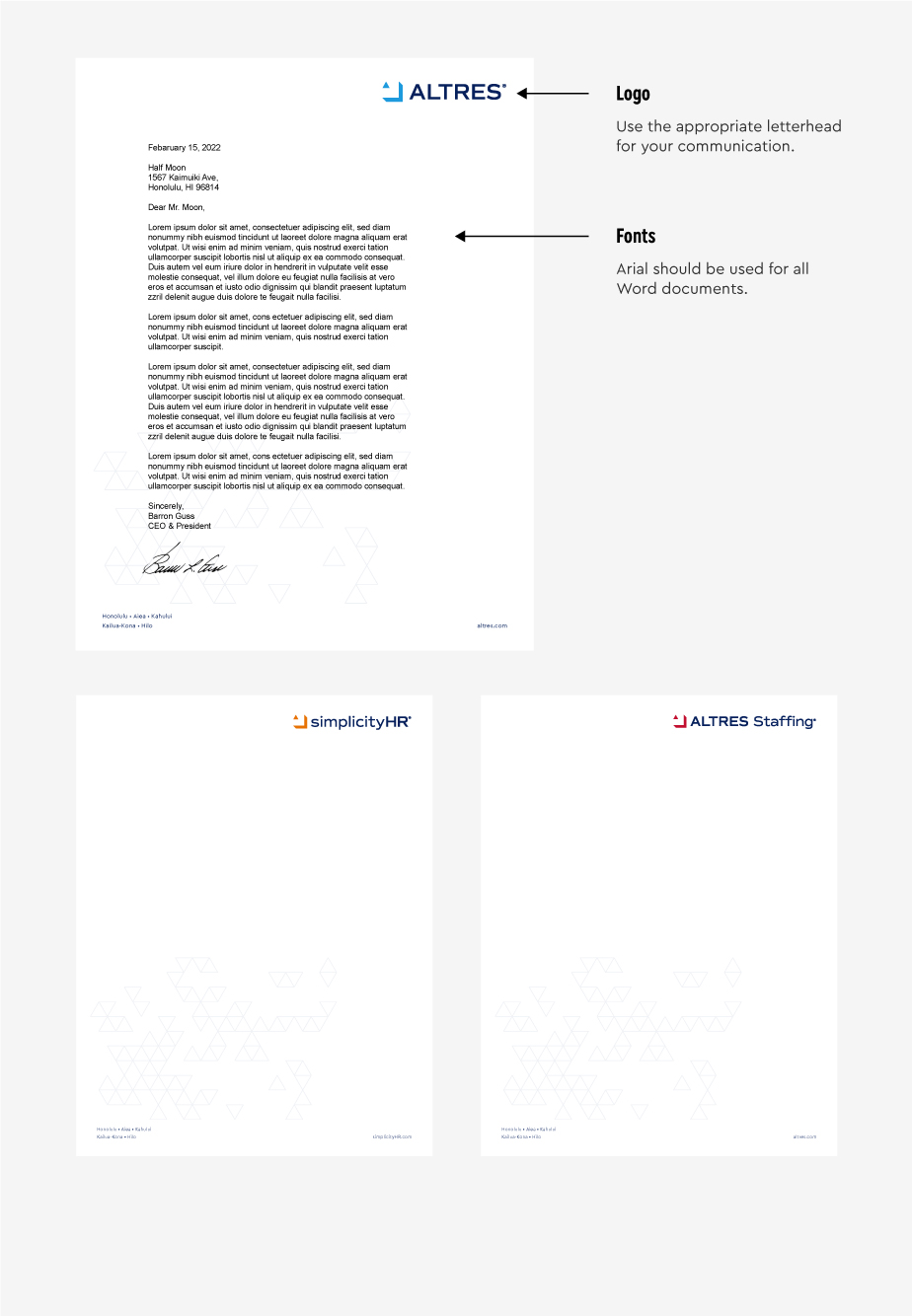
Letterhead
Our stationery consists of letterhead, envelopes, and business cards.
Envelopes
Our envelope system range consists of 9×12, #10 (+ window), and #11 (+ window).

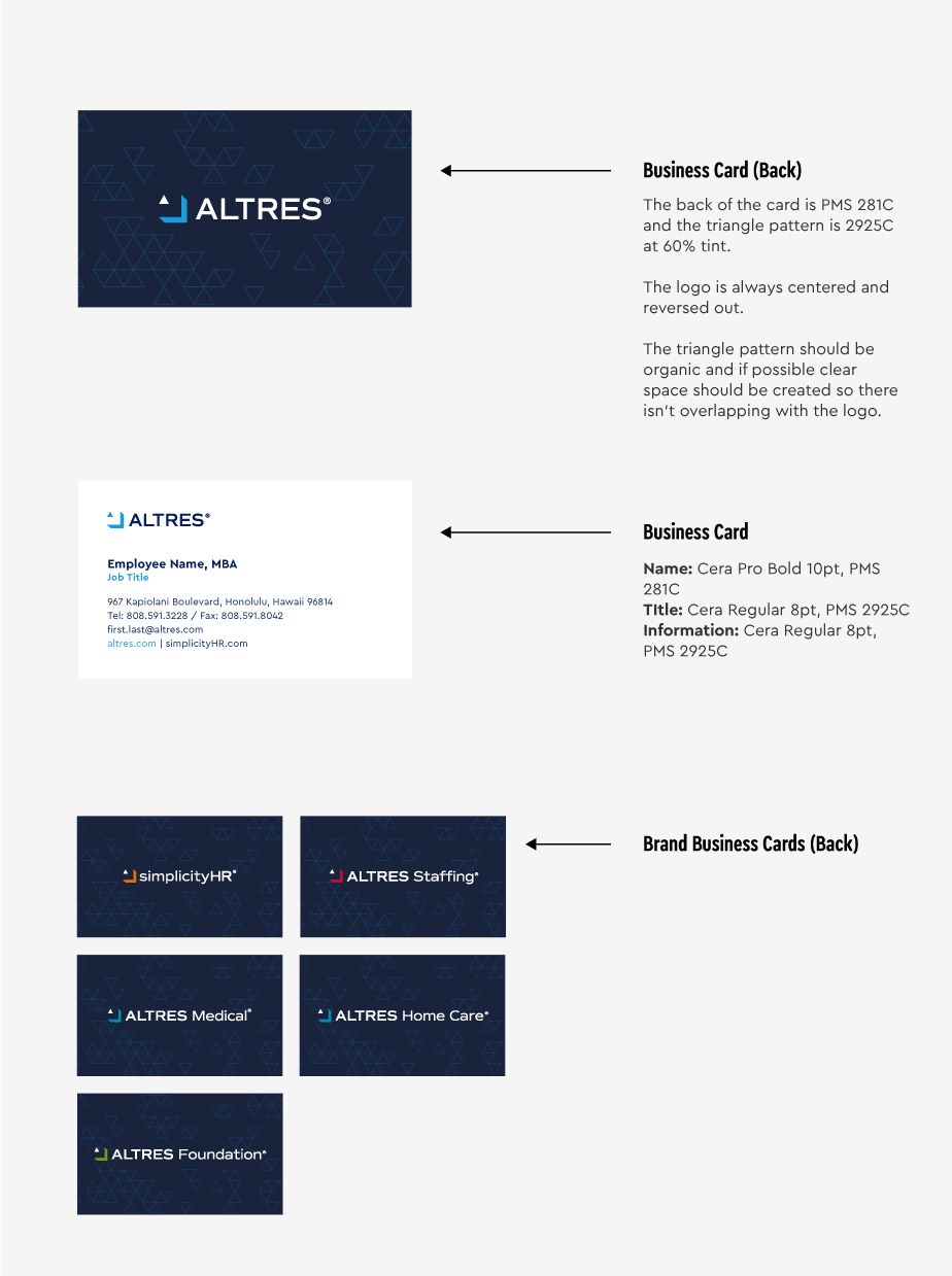
Business Cards
We have two sizes of business cards. The first is European sized, 2.125” x 3.375”. The second is North American sized, 2″ x 3.5″.
Brand Design System
Overview
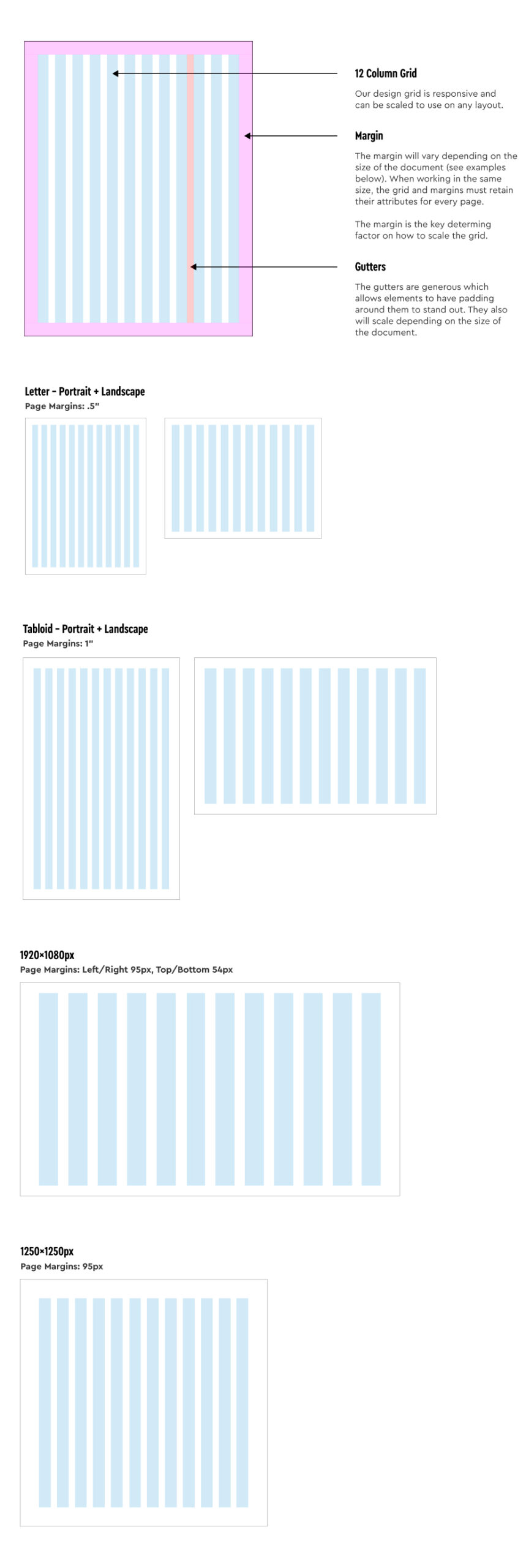
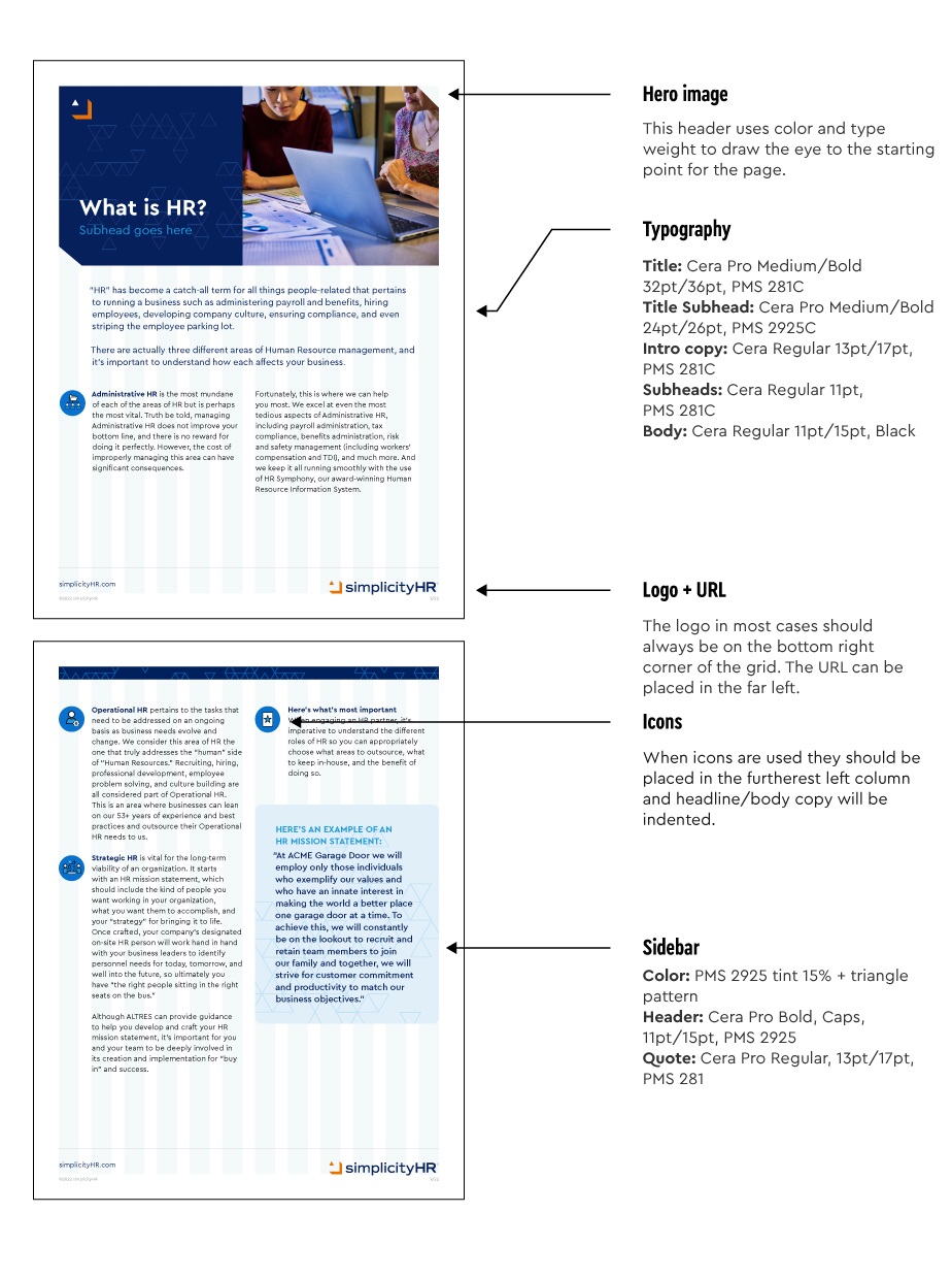
The brand design system unifies our communications and experiences that’s unique and instantly recognizable as the ALTRES brand. Our design system is based on a 12 column responsive grid and is used in all of our collateral, which includes: print, social, video and web collateral.
Cover Examples
This is one example within our guidelines that demonstrate how the grid can be used.

One Column Typography
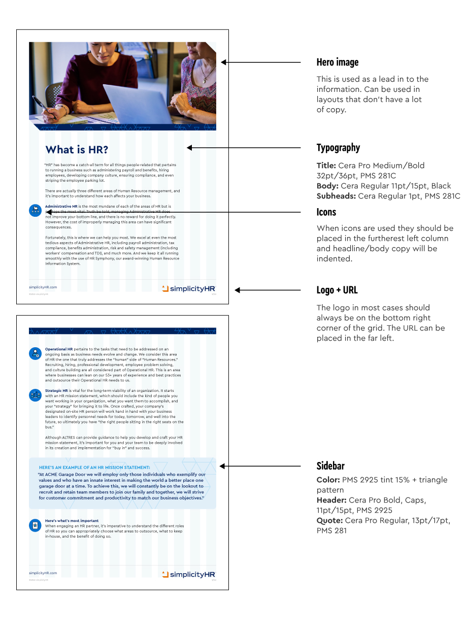
This example shows how a hero image can be combined with a “one” column of copy that expands 9 column grids. When using the grid for sales materials it’s important to note the length of each line of text. Ideally the text should should be 10-13 words per line.
Two Column Typography
This example shows how a hero image can be combined with a a solid block of color and a headline. The “two” columns of copy breaks the copy down into smaller chunks for easier reading. This layout is ideal if there is a lot of copy and the layout needs to be broken up into pieces.
Social Media
Overview
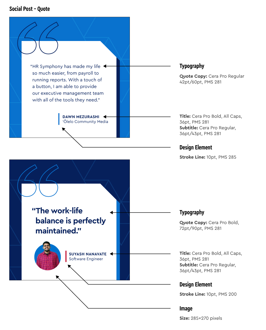
Social media is an essential tool for ALTRES brand communications and experiences. Our social media design system combines our grid, colors, typography. Please use these guidelines as a reference for future graphics.

Testimonials / Quotes
These are two of the variations for how a testimonial/quote can be designed.
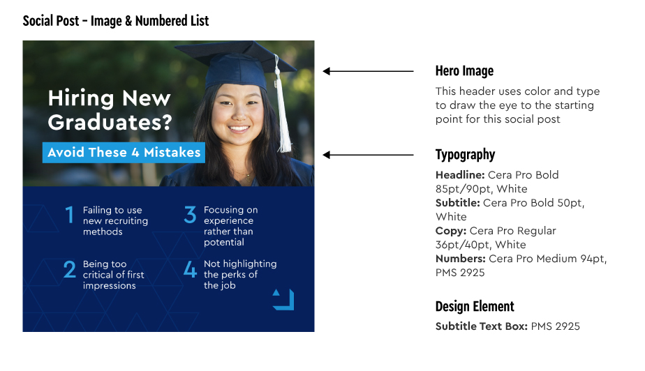
Numbered List
We often use numbered lists as way to communicate content via social media.
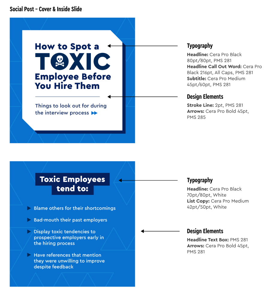
Cover and Inside Slides
Multiple slide posts are often used as a content strategy. Attention should be given to differentiate the cover from the interior slide(s), but still feel like part of the same presentation.
